portfolio from
ONTARIO INTL’ AIRPORT
ONT Paw Squad Re-Branding
mission:
ONT’s therapy dog program needed a new name and color scheme to match ONT’s current look. I was approached to redesign the program and help it align better within brand guidelines.
process:
The design process began with the creation of the logo, using the primary blues in ONT’s new branding guidelines. With the help of a calligrapher, I developed a three color logo that I felt fully embraced the new sentiment. Once developing the logo, I chose the handler uniform (which comprised of a branded t-shirt, jacket, and bag ) and the dog’s uniform of branded bandannas. Next was the task of creating new trading cards the handlers could distribute to passengers as mementos of meeting a new furry friend. The trading cards feature images I photographed and incorporated the new fun and fresh feeling with tidbits and stats on each dog.
results:
Since developing the new ONT Paw Squad, several designs and projects continued to arise. Every few months I conducted photo shoots of the dogs and used the imagery in airport advertising, social media posts, videos, floor decals, stickers and more. The ONT Paw Squad is now well known to travelers and my design continues to live throughout the terminals and online for all passengers to enjoy.
Images pictured: set of 2.5”x3.5” trading cards, 36”x36” circle floor decal, 2”x2” circle sticker, dog bandanna & handler uniform
Valentine’s Day Cards
mission:
ONT wanted to do something quirky and not seen before in the airport industry to celebrate Valentine’s Day. Focusing on the AvGeek community, I was tasked to create Valentine’s Day cards, to be shared digitally via social media and physically printed to be shared via the terminals to passengers.
process:
To begin the process, one must understand what the AvGeek community is. Anyone who is an aficionado with the aviation/airline industry is what’s considered an AvGeek. ONT wanted to embrace the AvGeek community during Valentine’s Day by providing specialized cards for them. I created several versions and ultimately designed eleven cards total. Each card contains a witty phrase with the design. Keeping within brand standards, all cards contained the two blues from the primary color palette and green and pink included from the secondary color palette. All cards also include the ONT logo and a “to” and “from” at the bottom so whomever decided to personalize them, had the option.
results:
On February 14th, 2019 the cards were debuted on ONT’s social channels including Facebook, Instagram and Twitter. They garnered high engagement amongst their audience. Physical cards were paired with a carnation and distributed to passengers as a community engagement activation, thanking them for their commitment to ONT. Card idea and design were so successful, they were shared again for Valentine’s Day 2020.
Terminal Drinking Stations
mission:
ONT installed drinking stations throughout both terminals and were looking for a way to highlight the area making easy to find by passengers. I was requested by the Terminal Manager to wrap them with bright colors and catchy designs.
process:
The process began with a catalog of each drinking station throughout the terminals. After documenting quantity, location and measurements of each station, I sat down to develop the copy for each station and which graphics were to be included. Each station would contain one of the secondary colors (green or pink) as the main background color. To keep designs light-hearted and informational, I played with puns and water/recycle statistics. To keep the stations cohesive, I included a stock photo of water to place on border walls around the main background design. Both terminals have a total of 16 drinking stations and not wanting to repeat designs, I created a total of 15 designs each unique to their location (only one repeated).
results:
Immediately after the wraps were installed, ONT passengers and staff commented on the designs and were elated they were produced. Due to the bright colors and originality, the drinking stations stand out against the white walls and architecture and allow passengers an easy time locating their next water fix.
Miscellaneous Branding & Promo Items
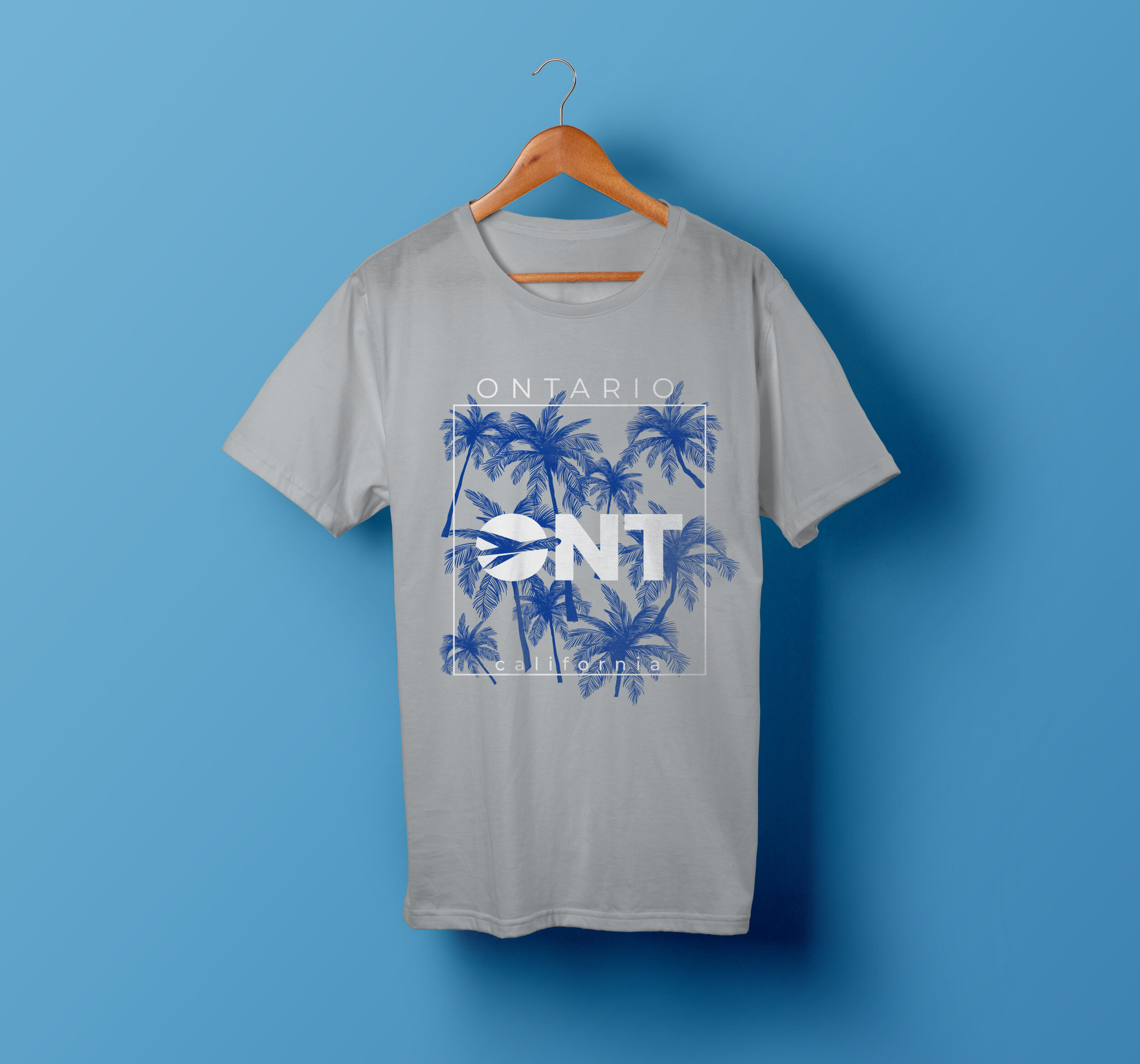
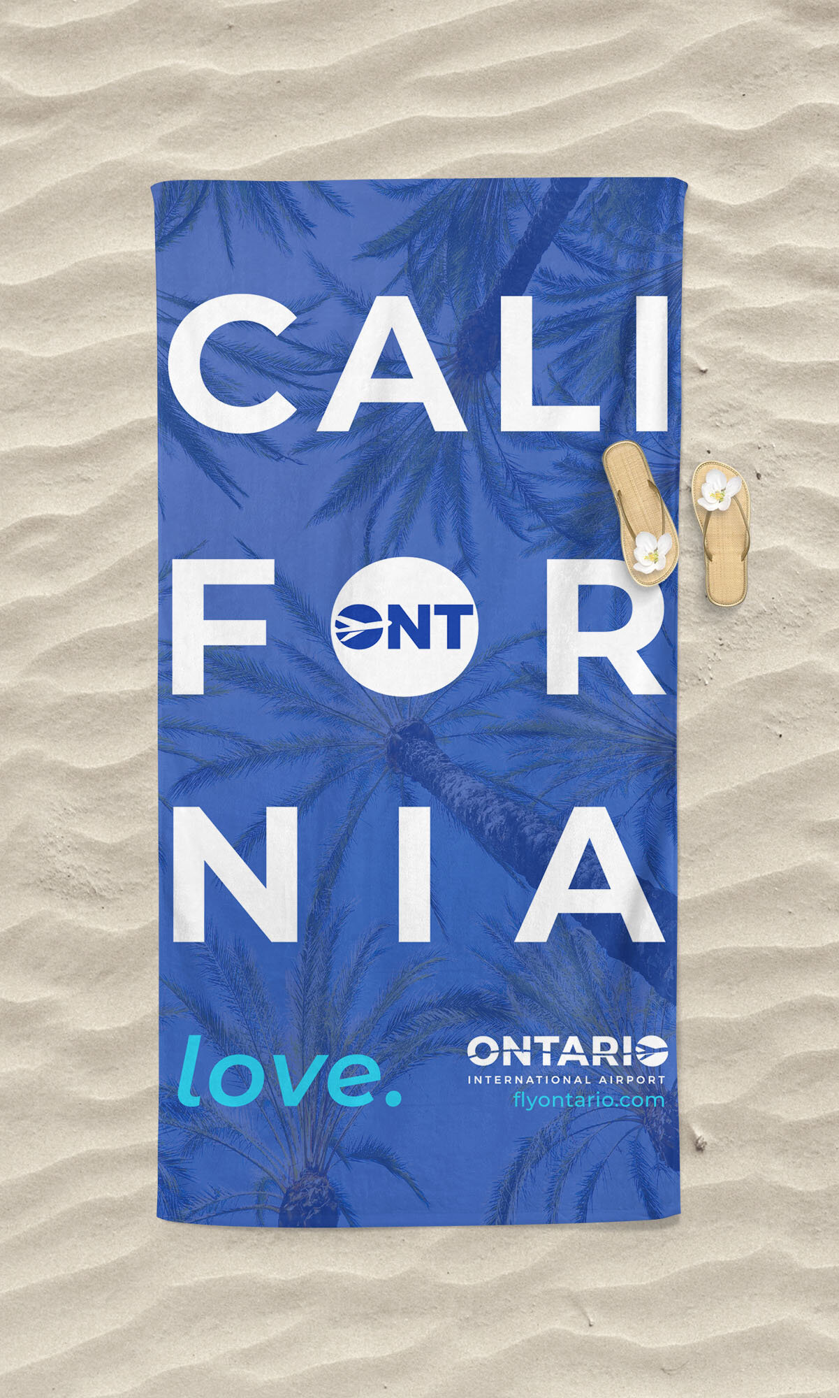
As a one-woman creative team, I was approached with many ideas and concepts from multiple departments. I was involved in terminal improvements ( i.e. dust wall designs, signage, etc.), outdoor advertising, print advertising, marketing materials, promo items and various signage throughout the terminals and office spaces. I was encouraged to try new things and to think outside the box. I used my own photography throughout majority of the designs and focused on bright colors and brand cohesion.


