portfolio from
HIGH COUNTRY NEWS
Monthly Issue Community Page Spreads
mission:
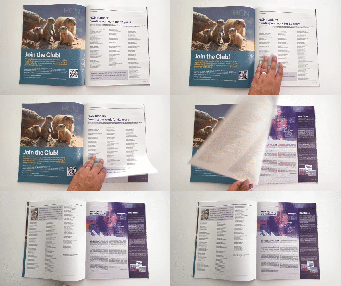
In every issue, High Country News features two spreads consisting of donor recognition and donor outreach. In an effort to develop an identity, I was asked to redesign the spreads.
process:
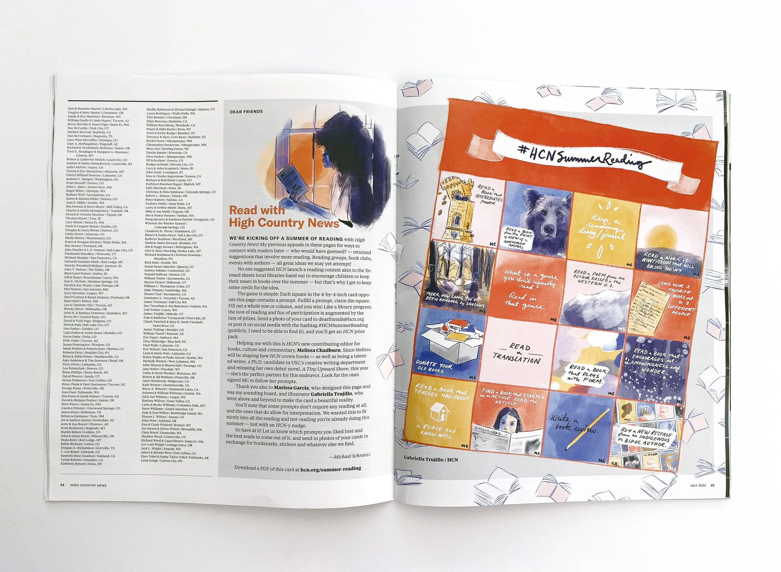
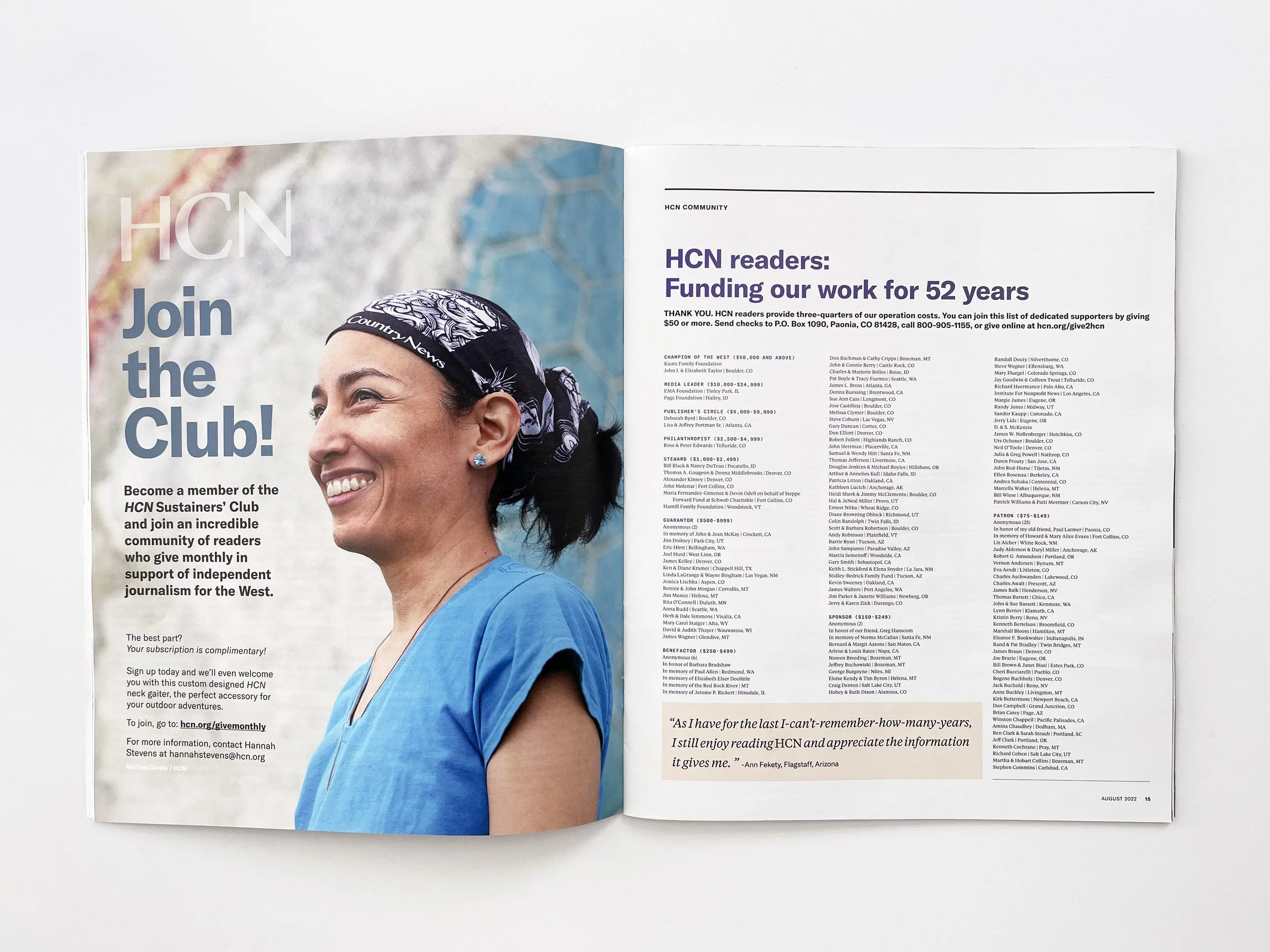
In a normal issue, each community spread contains a full page ad, two donor recognition pages and one Dear Friends column. As the donor recognition remains a list every issue, the redesign mainly refers to the full page ad and Dear Friends column. Whenever possible, I leverage my photography skills as the main photo in the full page ad. As much as I would love to say illustration is also in my repertoire, I cannot draw to the level I’d like to. Collaborating with New Orleans-based illustrator, Gabriella Trujillo*, the Dear Friends feature within the community pages gradually came to life. Once copy is given for Dear Friends, I brainstorm imagery that will enhance the story the best. Then working with Gabriella, I art direct the final illustration. Once the illustrations have been completed it is my job to lay out the spreads cohesively and creatively.
results:
The High Country News community page spreads now have an identity and are being noticed by both readers and staff alike. Each issue is unique and I enjoy the challenge each spread brings.
*Summer Reading and Dear Friends illustrations done by Gabriella Trujillo, whose work you can find here.
Images pictured: Above GIF is June 2022 issue and first complete spread I art directed and laid out. Above photo is July 2022 Dear Friends column and bottom photo is August 2022 ad and donor recognition spread.
HCN Board Handbook
mission:
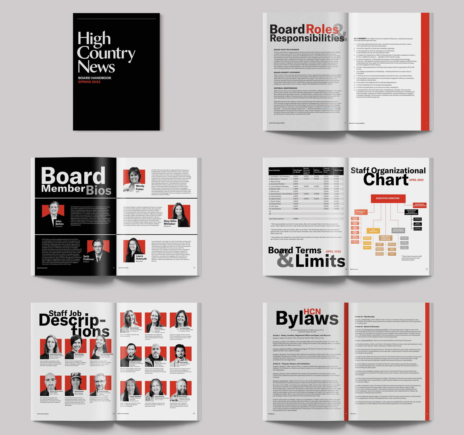
The High Country News board handbook was a book concentrating more on information than design. That is usually the case any time an organization needs to put together this type of literature. For this rendition, HCN wanted to level up the handbook and asked me to completely redesign it. This handbook is given to the Board of Directors each time they receive a new board member as the book of knowledge behind High Country News.
process:
When I begin a project of this magnitude (final product comprised of 52 pages), I like to see what has been done earlier, what has worked well and not so well. All the content was taken from the previous presentation, but I knew there would be a better way to illustrate people, places, statistics, and graphs within the updated version. In order to keep the design cohesive and readable/understood, I concentrated on the three primary brand colors and focused on black and white imagery. To the reader, each section is easy to determine based on design, color and large title typography. I edited each photo, rearranged information in a straightforward manner, produced clean charts and tables and developed a handbook worthy of reading.
results:
After completing the design, the handbook was given to the board members and HCN staff. I received feedback that the design was a huge improvement from previous versions. Shortly after the board handbook, I was asked to redesign the board meeting reports with the same aesthetic in mind. Although the designs are more time-consuming, I love the challenge of organizing information in ways easy to understand and bringing the content to life.
Sustainer’s Club Direct Mail
mission:
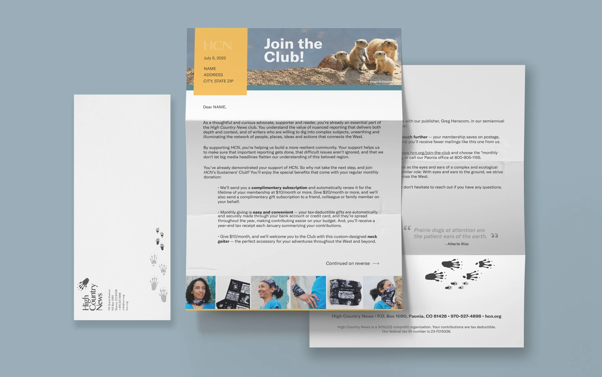
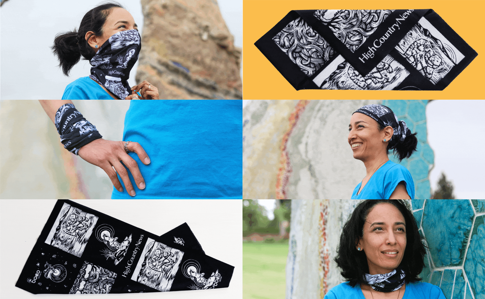
Fundraising is essential in non-profit work and one of the original ways to raise money has always been through direct mail. In their quarterly campaigns, HCN sends out direct mail to segmented donors. The Sustainer’s Club is an elite group of donors that regularly contribute to the organization. For this appeal, I was asked to devise a look and feel centered around prairie dogs and an HCN-branded neck gaiter*.
process:
The campaign stye frequently begins with the curation of direct mail. From there it progresses to print ads, social media, newsletter headers, and sometimes promo items. This particular campaign was unique as there was already a promo item to be featured: the neck gaiter. As a special gift for donating, the reader would receive a neck gaiter in the mail. And due to the name “Sustainer’s Club”, the fundraising team wanted imagery fixated on "groups/clubs.” Therein lies the family of prairie dogs (western animals known for their social behavior and living in groups). The task of combining both a neck gaiter and prairie dogs into one campaign was a bit tough but I was able to make it happen. Focusing on two brand colors, yellow and teal, I devised a simple yet impactful letter and envelope design. And rather than just including a photo of the neck gaiter on a white background, I planned a photoshoot at a nearby park.
results:
The Sustainer’s Club mailing was distributed to over 7800 donors and compared to 2021’s mailing, it was more successful and raised 25% more in donations. The images from the photoshoot were so popular amongst staff that they would go on to be incorporated in social content, a full page magazine ad and a newsletter GIF.
*Neck gaiter illustrations done by Daniel González, whose work you can find here.
Images pictured: Above mockup of letter design. Below newsletter GIF.
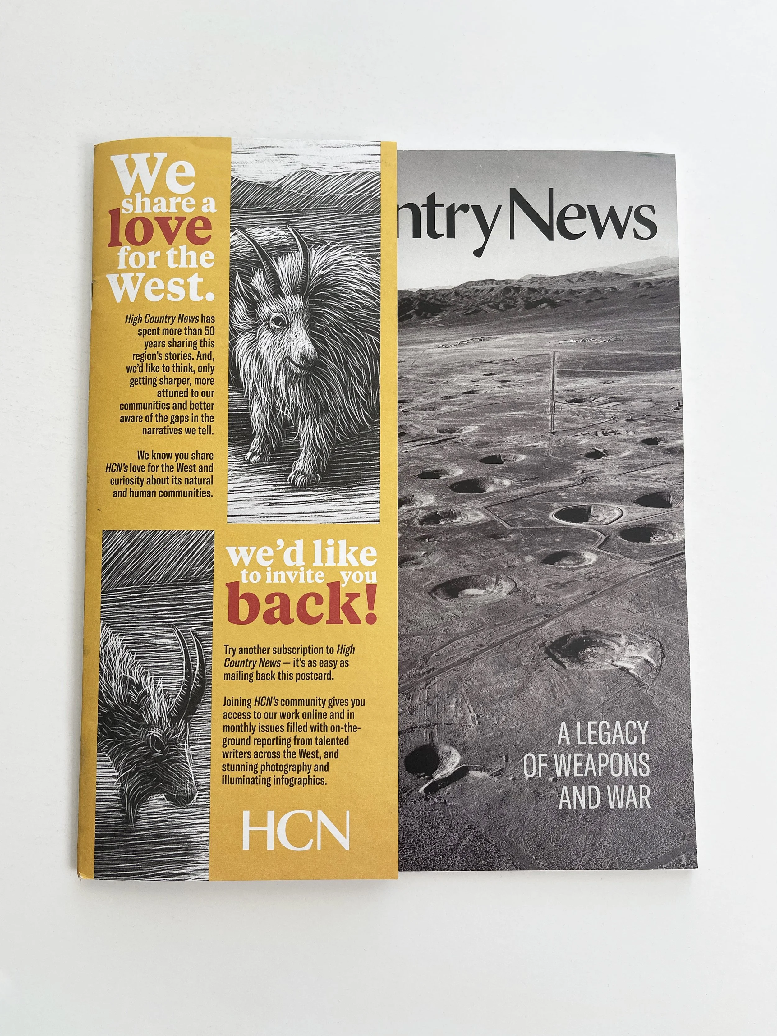
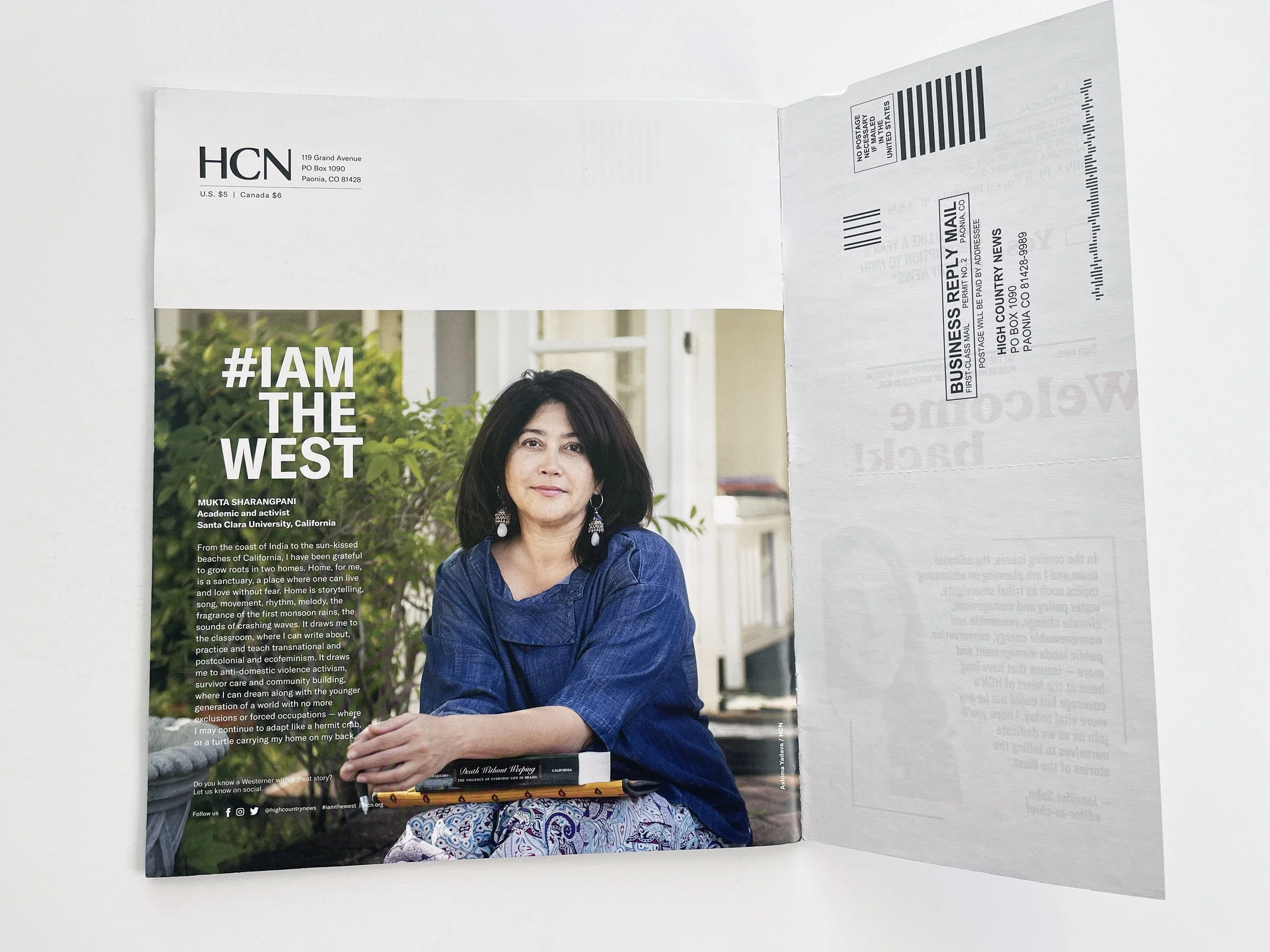
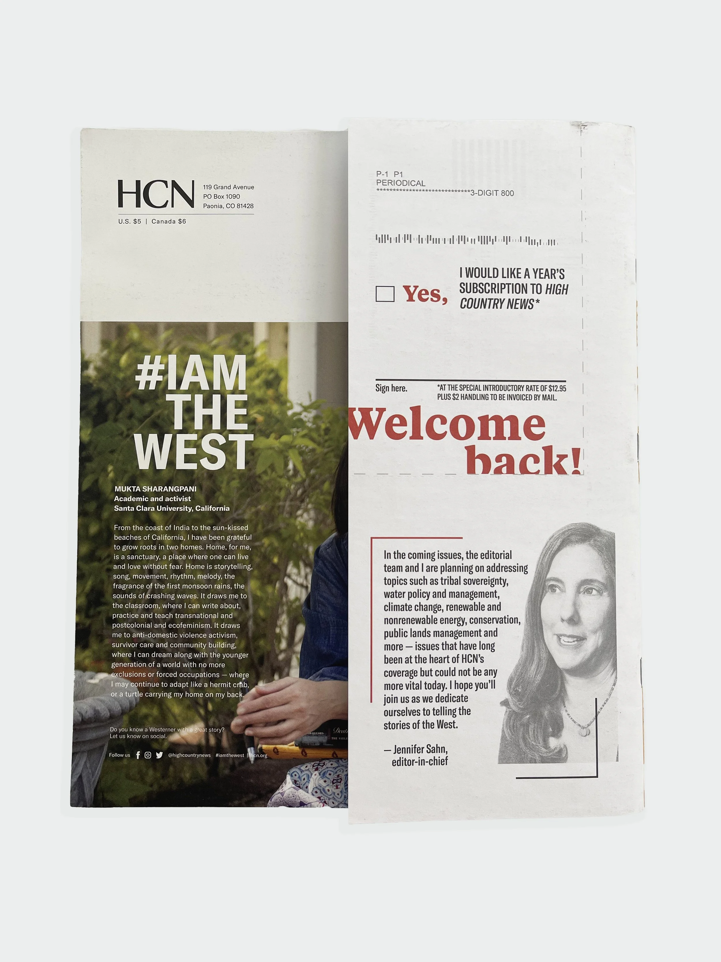
Images pictured: Above cover wrap design front panel. Below are inside and back panel design.
Lapsed Donor Cover Wrap
mission:
The HCN marketing team approached me with the idea of designing a cover wrap for lapsed donors. The purpose was to re-introduce readers to the magazine as it currently is written. The audience would have the opportunity to read the current issue, and make the process of resubscribing as easy as possible with the tear-away form.
process:
First step in the process was determining the cover wrap size. Ultimately, we decided on the wrap filling up the entire height of the magazine and half of the width (to keep the cover recognizable). The design was to be double-sided, color on the front and black and white on the back. The mail-in tear away form needed to be included, as well as a note from the editor. I wanted the design to be strong enough on its own but not too strong as to take away the focus from the current issue’s cover. And due to the uncertainty of which issue the cover wrap would be placed on top of, I knew the concept had to be evergreen. Based on previous mailings I’ve devised, and on color theory, I chose yellow as the main color. Yellow is attention-grabbing and evokes a feeling of warmth. Incorporating HCN’s primary color palette (red, black and white) paired with a black and white illustration done by Washington D.C. based artist, Kate Samworth*, the cover wrap was developed. When High Country News began in Lander, Wyoming, the goat was their beloved representative (since mountain goats occur naturally only in the northern Rocky Mountains). We chose Kate’s artwork as the focal image to pay tribute to the cherished billy who started its journey with HCN.
results:
This cover wrap concept was a first of its kind to HCN subscribers. We worked with a printer in order to establish paper finish, form perforation, and of course sizing. The cover wrap made it successfully through USPS mailing and into the hands of readers. The wrap initially went out to 3000 lapsed donors with a 6% success rate in resubscribers. Due to the increase, there will be a second mailing with a slightly edited design. Each time the cover wrap is sent out, there will be minor adaptations, all with the goal of reaching as many resubscribers as possible. All in all, the project has been successful and the design bright, modern and easy to read.
*Goat illustration done by Kate Samworth, whose work you can find here.
House Ads
mission:
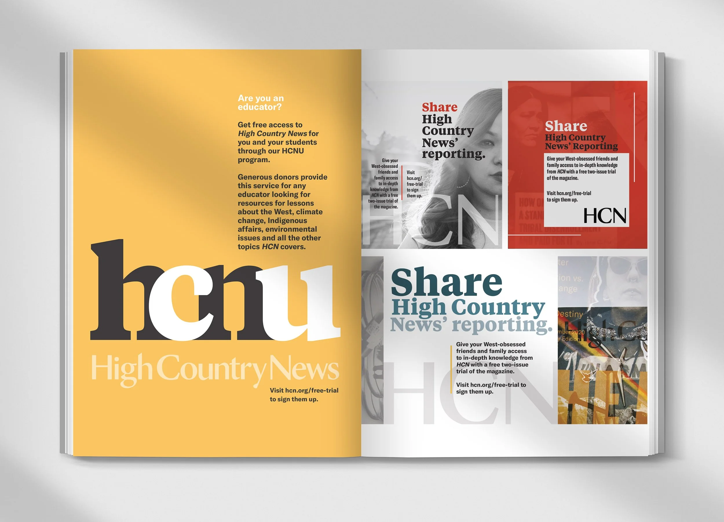
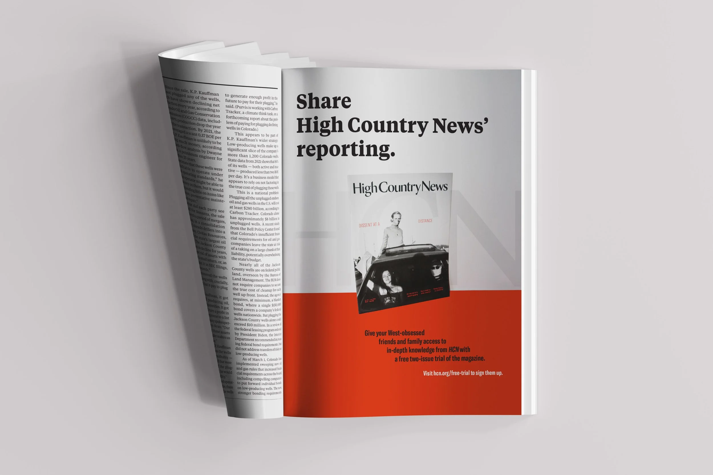
One of the introductory projects I was assigned at HCN was to develop a series of house ads for both digital and print purposes. These types of ads run on the HCN website and in the magazine to use space left from unsold inventory. The marketing department requested updated imagery with a simplistic aesthetic. Sizes in the magazine vary from 1/8 of a page to full page. And the digital ads, range from standard leaderboard, to display ad unit 300x250 pixels.
process:
Once receiving the task, my initial thoughts of design centered around typographical elements and impactful photography. For the print ads, I stayed within the primary color palette of red, white, and black. And when I introduced a pop of color, it is almost always yellow. The house ads feature the HCN logo prominently as to distinguish amongst various vendor ads within an issue. The digital house ads offer a more condensed layout since they are significantly smaller in size. They also do not feature imagery due to size of pixels. I did, however, curate a color palette for each set of messaging (i.e. cool colors for trial prompt, primary colors for support prompt, and warm colors for subscribe prompt) to further differentiate them. Additionally, to enhance concepts, I have used my own photography in assorted print ads.
results:
There is now a plethora of house ads (both digital and print) for the marketing department to choose from when needed. All ads were curated to be evergreen.
*Photography done by Roberto (Bear) Guerra, whose work you can find here.
Images pictured: Above are numerous print ads (1/4, 1/2 and full page). These ads would not normally be laid out in this formation, this is solely for mockup purposes. Below another full page house ad. Digital ads as static and mockups turned into GIF’s.
Miscellaneous Projects
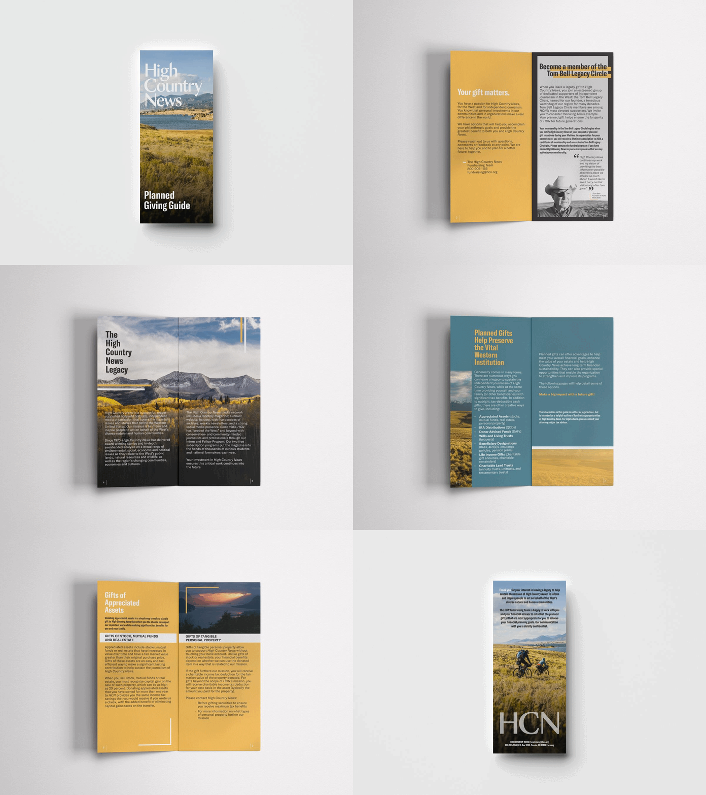
One of my favorite parts about working at HCN is the variety of projects. As a creative I enjoy a plethora of design: from digital ads and e-newsletters, to social media posts and motion graphics, I embraced all projects assigned to me. Below are examples of the diversity in tasks.
High Country News is an independent, reader-supported nonprofit media organization that covers the important issues and stories that define the Western U.S. For more information, visit hcn.org.
