portfolio from
FREELANCE
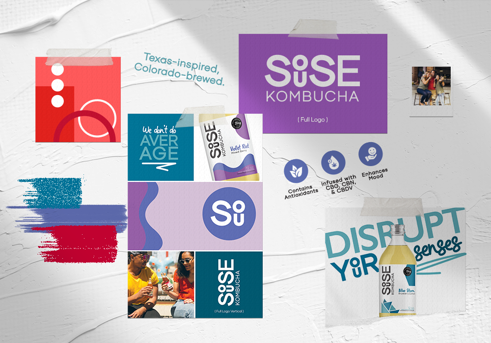
Images pictured: GIF featuring debut drinks and catchphrases, mood board, Blue Storm label design, and logo variation with brand language
Souse Kombucha
mission:
Souse Kombucha is a Colorado-based beverage start-up that has infused CBD-oil in kombucha to create a unique and beneficial drink catered to consumers who live a health-conscious lifestyle. They reached out for assistance in creating a brand identity and label designs for their kombucha debut.
process:
First course of action was to determine the audience, vibe and style of what they wanted their brand to achieve. Modern, simplistic and bright were the keywords that arose from our discussion. After researching the competition and experimenting with colors, I settled on a minimalistic pattern and color palette to be featured for each flavor. Creating a clean look while highlighting the drink color itself was an important factor that lead to label design standing out on the shelf amongst its competitors. Souse Kombucha has currently started with two flavors and in the process of releasing two more. Whilst designing the initial two, I went ahead and prepared the other color combinations (one being shades of red and one yet to be determined). I also put together several versions of the logo to be used in various locations: full logo, logo with brand language, vertical logo, and icon only. In order to achieve brand cohesiveness, I assembled a brand mood board presenting the logo variations, color palettes and assorted imagery (featured photos not mine). As far as the label designs go, I not only created the look and feel but also copy wrote the information on the backside.
results:
Souse Kombucha now has an established brand identity and two completed labels that are currently in production as of summer 2022. Their logo is modern, unique and has the potential to develop even more brand assets in the future. The “o” and the “u” of “Souse” lends quite well to a figure of a person and can be used in an array of patterns and arrangements. I believe the cornerstone of a brand identity is one with the ability to expand. By and large it was an exciting project and a great way to once again revel in lively colors.
It’s a Penalty
mission:
It’s a Penalty is a UK-based non-profit organization with a mission to educate the world on human trafficking - to enable everyone to identify and report suspected cases, and protect and prevent those at risk from becoming victims. I was requested to bring ideas to their ever-growing campaign, “What is Human Trafficking” by designing content for their social media channels.
process:
After analyzing the data and previous communications (social channels, landing page and videos), I came to the consensus that the organization could benefit from motion graphics and an improvement in their photography. Their previous social posts featured a plentitude of information but not as engaging as it could be. I wanted to not only introduce motion graphics, but also initiate a platform for a podcast, featuring survivors of human trafficking. Storytelling is an impactful venue for fundraising so recommending a weekly podcast seemed like an ideal idea.
results:
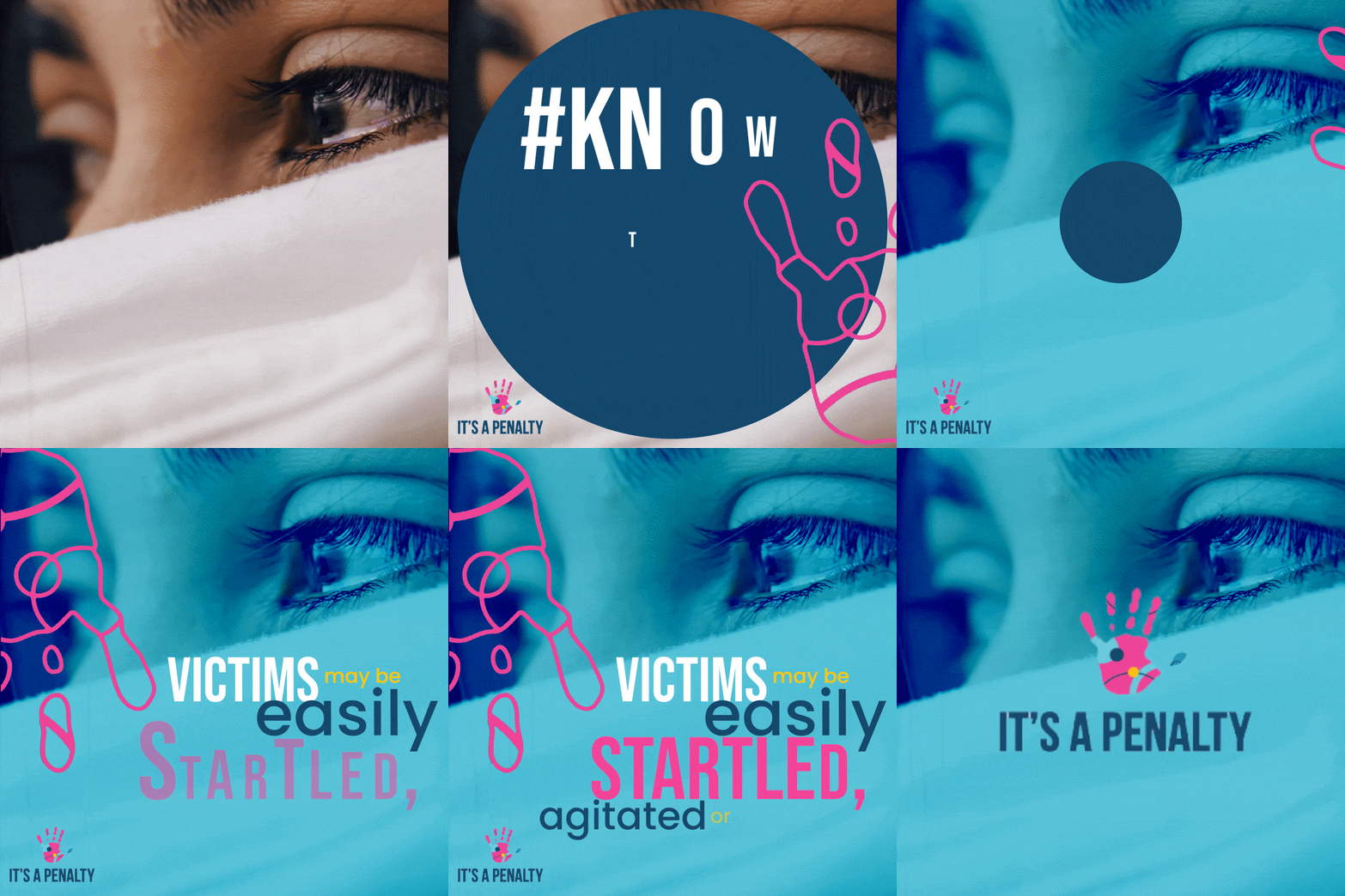
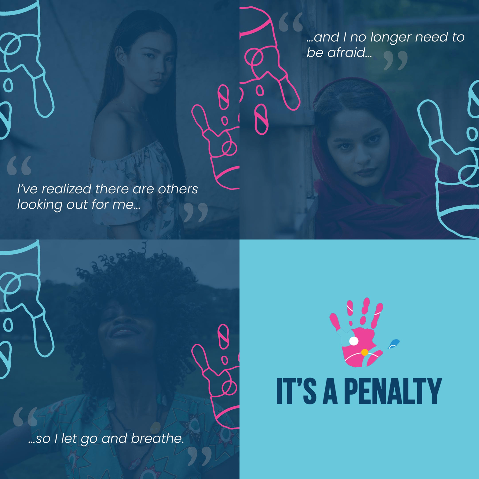
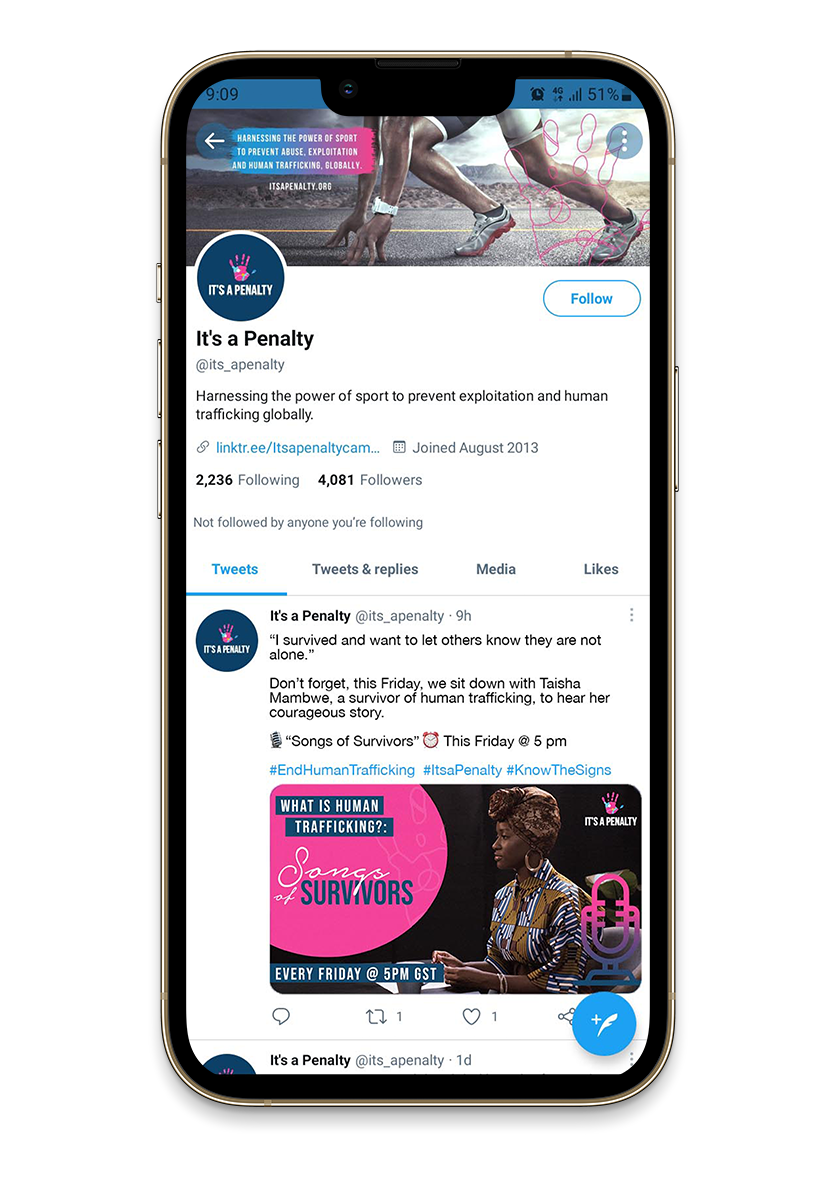
Part of the “What is Human Trafficking” campaign is the hashtag #KnowTheSigns. In order to reinforce this message, the motion graphics I created all contained the hashtag in the post copy, and with one in particular featuring one of the signs - “victims may be easily startled, agitated or afraid” as part of the GIF entirely. Also wanting to include the voices of the survivors in a respectful, anonymous manner, I put together a GIF with stock photography and a quote - much more engaging than a static post. And lastly, focusing on the podcast idea, I put together a series called “Songs of Survivors” and assembled the third motion graphic GIF and post announcing the new endeavor. All in all, I successfully established motion graphics and new ideas for the “What is Human Trafficking” campaign and brought fresh ideas to the progressive organization.
Images pictured: two 1080x1080 Instagram posts, Twitter post mockup
Images pictured: 8.5”x11” flyer, school logo mockup, & 1080x1080 Instagram seamless carousel post.
Denver Public Schools
mission:
Denver Public Schools is the public school system in the City and County of Denver, Colorado and its mission is to provide all students the opportunity to achieve the knowledge and skills necessary to become contributing citizens in their diverse society. I was tasked with three separate goals for DPS: Create a school logo and a social media post using Marrama Elementary’s branding and create a double sided one pager in English focusing on SchoolChoice.
SchoolChoice is a unique school enrollment process based on fairness and equity. This flier is one of the first "touchpoints" DPS has with families, a simple "save-the-date" announcement distributed in late fall. This unified one-application, one-deadline system simplifies enrollment for families and ensures equitable access to quality schools.
Marrama Elementary is an ECE (Early Childhood Education) – 5th grade school in Green Valley Ranch. I was to create a new school logo helping capture the spirit of their school. The logo was to also be used in an original social media post with the message of new enrollment dates.
process:
Being careful to use DPS colors, fonts and patterns, I kept true to their branding and worked to produce a clean, easy to understand flier. Photography was not done by me, but instead taken from the DPS photo bank. Concentrating on visual hierarchy, I made sure all important information stood out amongst all other text.
As for the elementary school branding and social post, I chose to keep the child-like characteristics of schools intertwined with bright photography. To keep it interesting I created a seamless carousel post with each square incorporating strong enough photography/creative to hold its own as a solo piece. The only requirements for the formation of the Marrama Elementary logo was to keep in the green/emerald tones and feature a mustang. In order for the logo to be used in various formats, I made it circular and added the school motto for an added flair.
results:
Feedback given for all work was overwhelmingly positive and staff behind the SchoolChoice project could not wait to use the flyer for upcoming dates. Marrama Elementary branding was successful and ultimately gave the school a more modern and clean aesthetic.
City of Aurora
mission:
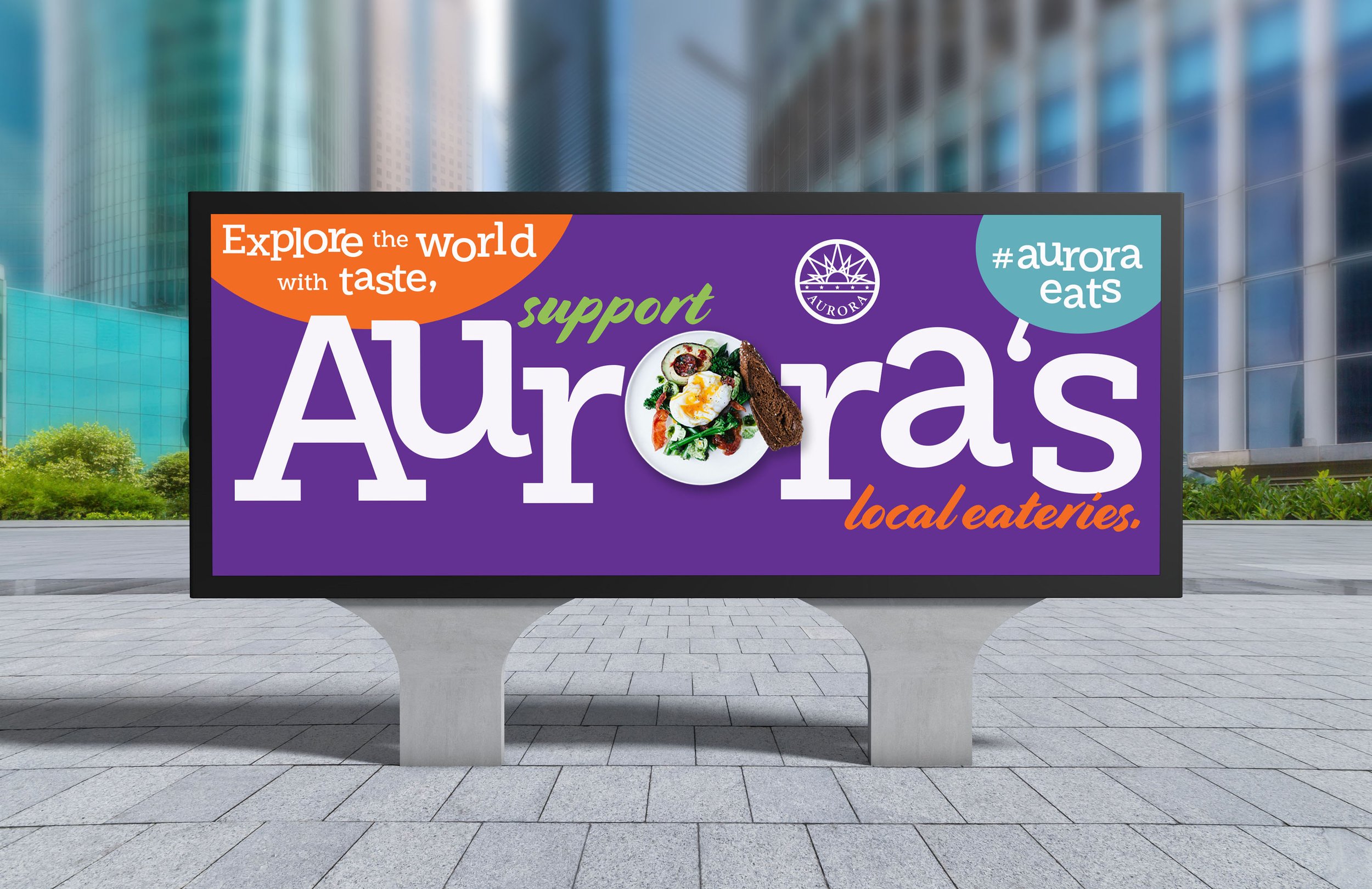
The City of Aurora is municipality and the third largest city in Colorado. I was tasked with designing three digital ads with a focus on a marketing campaign supporting local restaurants. At least one of the ads was to include animation or motion of some type. The idea behind this campaign would not be specific to any one restaurant but speaking to the vast international restaurants Aurora has to offer, which makes the city unique.
process:
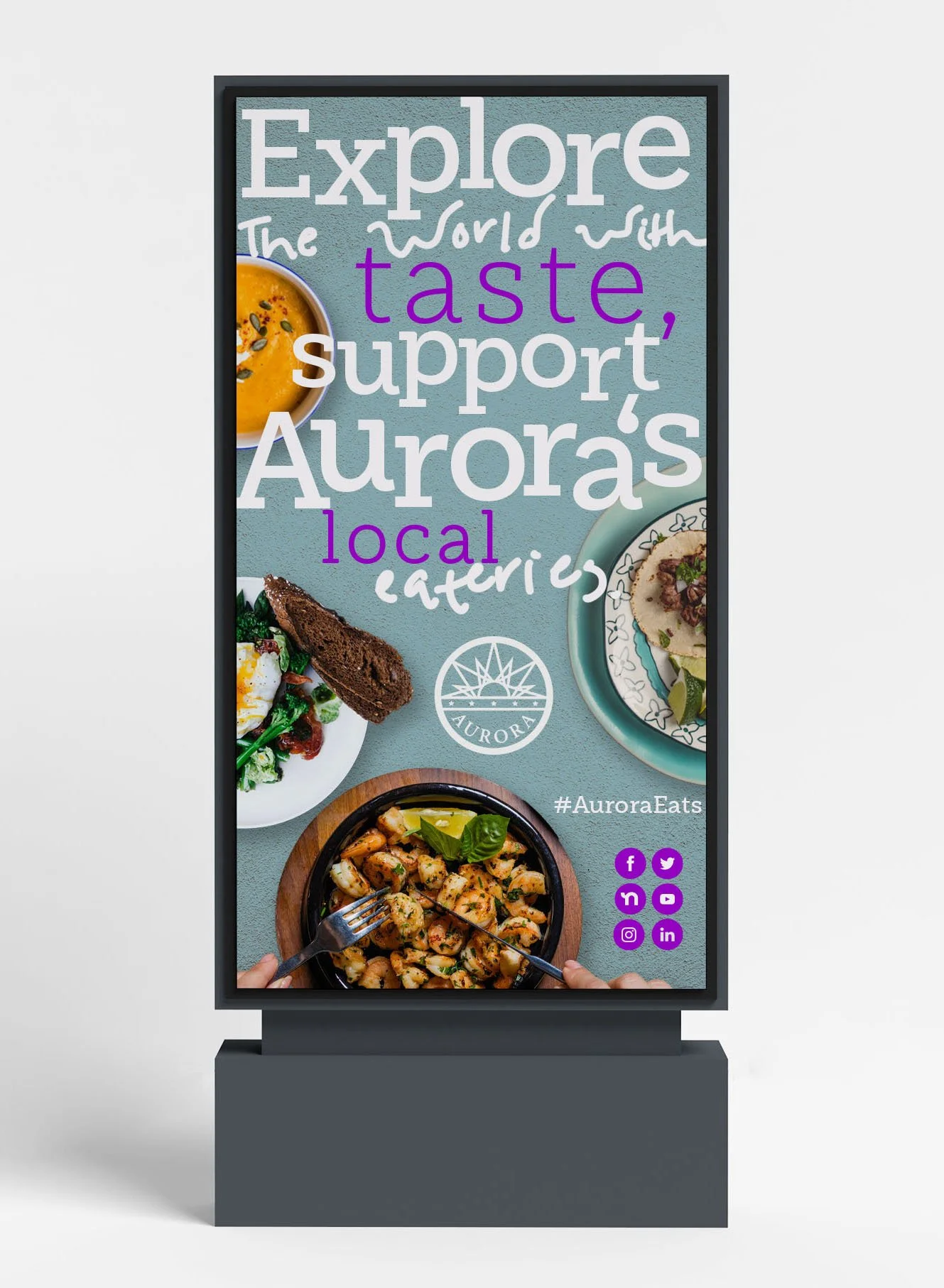
Being a photographer myself, I knew incorporating vibrant photography and catering to as many bright colors in the ads would be the ideal route to take. When designing ads centered around restaurants, photography is incredibly important. After deciding on which stock photos to use, I divided the ads into their designated media: outdoor billboard, social media paid ad, and digital backlit diorama. All three ads were cohesive in their colors, fonts and photography. For the digital diorama ad, I added my own written font to add character and originality to the concept. And for the social media paid ad, I created a GIF with motion graphics done in After Effects, including all the various foods from local eateries in Aurora.
results:
The marketing campaign is set to go live in 2022 and will feature content based on my initial concept ideation: strong, vibrant photography and motion graphics.
Images pictured: Outdoor billboard ad mockup, digital diorama mockup, social media paid ad
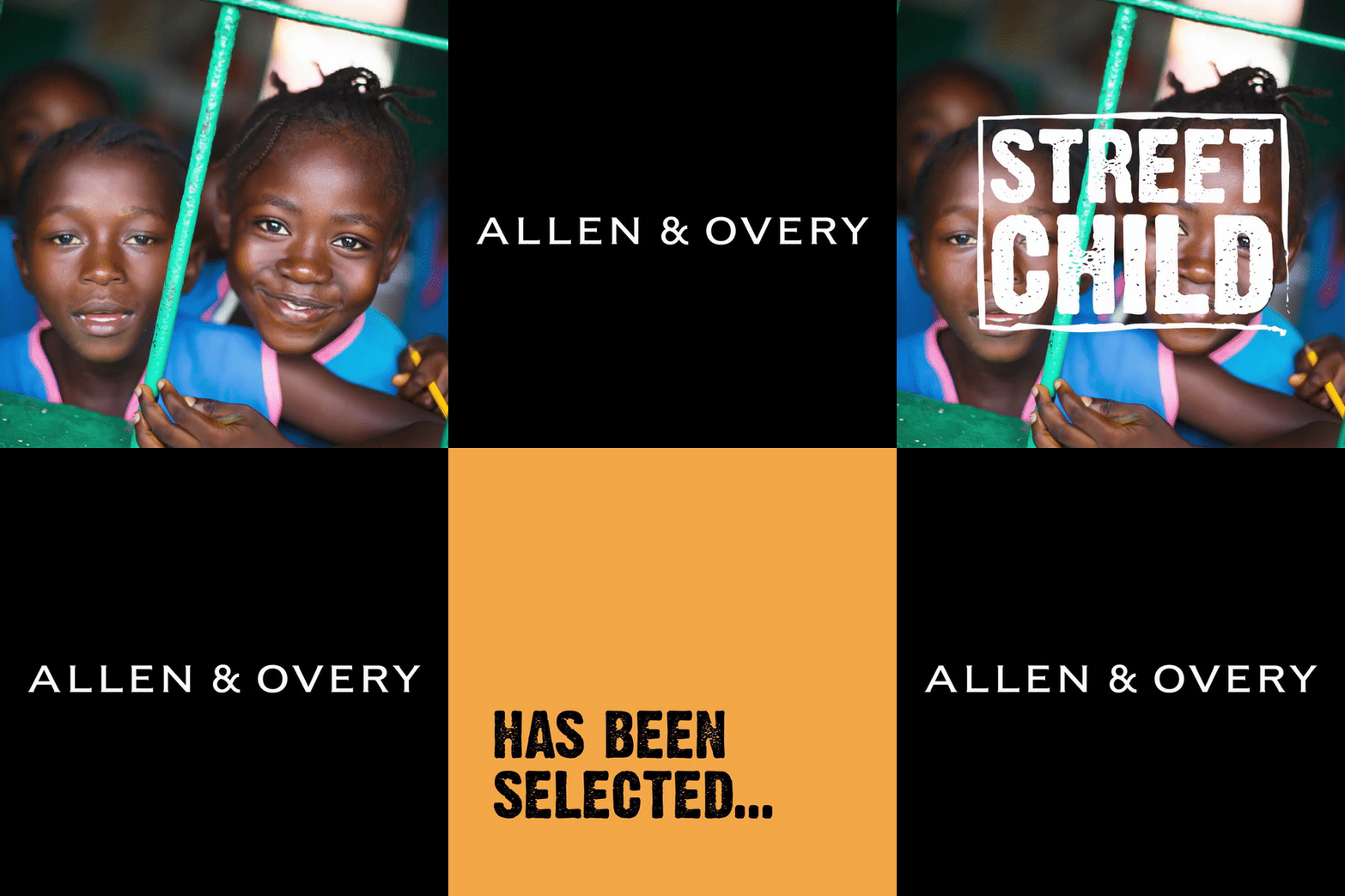
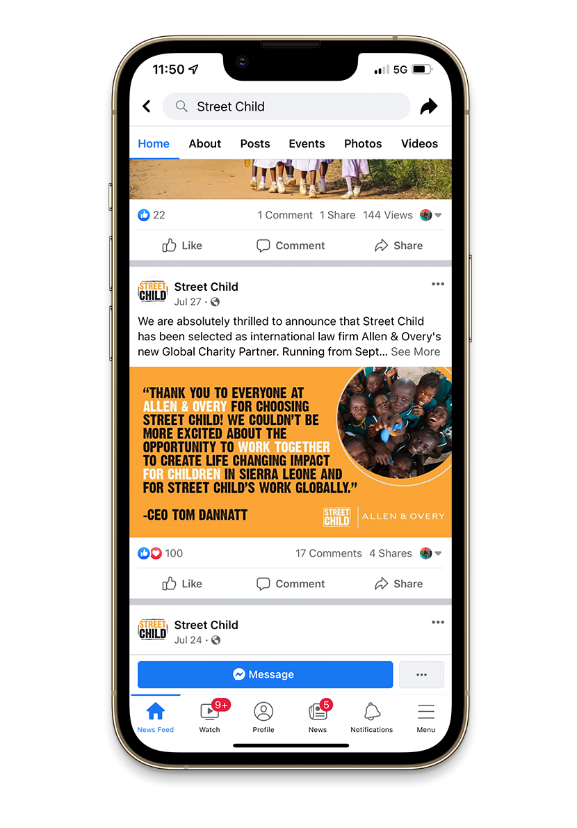
Images pictured: 1080x1080 Instagram GIF, Facebook post mockup, Twitter post
Street Child
mission:
Street Child is a UK-based organization that believes every child deserves the chance to go to school and learn. They focus on children in the world’s very toughest situations; and a belief in the power of local organizations. I was brought in to improve social media content and increase engagement. During a brief stint, I was able to boost their content creativity and introduce motion on their channels. (Video addition can be seen on Videography page).
process:
As being part of the Street Child for such a short time, I wasn’t able to completely delve into analyzing their social channels and audiences or establish a social strategy. Instead, I focused on creating content with their beautifully-taken photography and videos shot by local staff. Not only concentrating on static content, I made sure to put together GIF’s and piece video content into short form videos. Each post created was cohesive to their overall branding, with the end goal of improving the content look and feel.
results:
Street Child was thrilled with the help given and valued my insight into their content creation. Positive feedback was given and I hope to work with Street Child again in the future.
